121
121
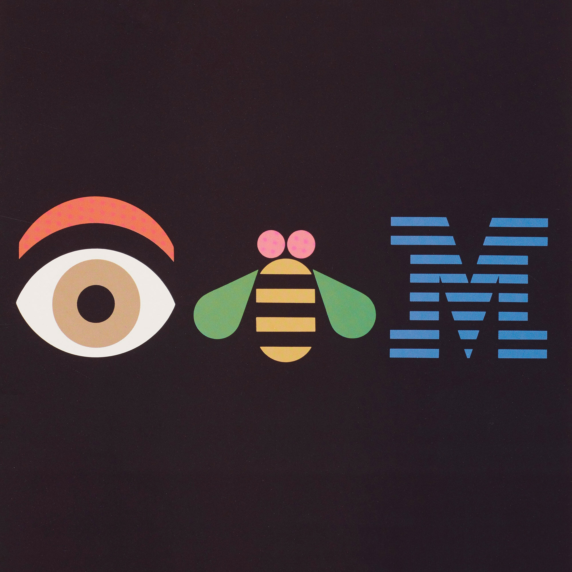
USA, 1990
offset lithograph on paper 36 h × 21½ w in (91 × 55 cm)
offset lithograph on paper 36 h × 21½ w in (91 × 55 cm)
estimate: $500–700
result: $625
follow artist
Printed signature to upper right: [Paul Rand].


In our daily work we have all had the opportunity to employ, study, criticize, or exercise our talents or authority in the use of the IBM logo.
Paul Rand

In 1956, Paul Rand would begin his landmark work for IBM, and over his three decades with the firm would fulfill his modern vision for graphic design. Rand was brought into the firm by acclaimed architect Elliot Noyes, who was hired to move the historic IBM identity in a modern direction. Thomas J. Watson, Jr., founder of IBM stated “[G]ood design must primarily serve people, and not the other way around. It must take into account human beings, whether they be our employees or our customers who use our products” and it was this foundation upon which Watson, Noyes and Rand would develop the groundbreaking design ideology for the firm. While Noyes focused on the products and architecture, Rand began to develop the enduring visual identity. From his transformation of the iconic IBM logo to the revolutionary Eye, Bee, M rebus design in the 1980s, Rand's designs for IBM left not only an indelible mark on the company, but would forever alter the approach of modern graphic design.


Stripes have appealed to people of dramatically different persuasions and cultures. Stripes evoke exciting images of Romanesque architecture, African ornament, and Parisian fashions. They are part of a geometry which decorates and animates. Stripes are indelibly linked with the IBM image, and serve a useful function as a background pattern.
Paul Rand
Paul Rand 1914–1996
Paul Rand was born Peretz Rosenbaum in Brooklyn in 1914 to Orthodox Jewish immigrants. His father owned a small grocery store, for which Rand often painted signage and advertisements. As a young man, Rand studied at Parsons School of Design and Pratt Institute but never finished a degree. He found the courses unstimulating, as many of the era’s arts programs were stuck in very classical methodologies. Independently, Rand studied early 20th century European modernism, which influenced much of his early designs. He drew influence from the Bauhaus, Constructivist, Cubist and de Stijl movements, as well as the art of Paul Klee, Alexander Calder and Joan Miró.
Rand’s career led to monumental shifts in the field of American commercial design. When he began working in media promotion and magazine design in the early 1930s, there was a small group of American and European expat designers who were beginning to combine the experimental formal vocabularies of European design with the demands of American commerce. Rand employed photography, montage, collage and “new typography” — all methods popular among European modernists. These practices often produced clever, minimalist designs, which stood out from the advertising of the era, which, in an emerging industrialized culture still hobbling out of the Great Depression, was more concerned with promoting prosperity and the status quo.
Rand’s demand for high quality and intellectual rigor were made apparent early on, designing for Esquire-Coronet, Apparel Arts and most notably, Direction magazine from 1937-1941, where he often worked for little to no money in exchange for creative freedom. When he was just 23, he was given the position of art director at Esquire. During this time, he also developed the unique presentation style that he became known for: pitches were often accompanied by hefty binders of drafts, references and research, effectively exposing the design process as a methodical, searching, spiritual distillation to bring about a pure marriage of idea and image.
In 1942, Rand began designing advertising and packaging for companies such as El Producto Cigars and Ohrbach’s department stores, as well as book covers and exhibition posters. The same year, he began teaching at Cooper Union, with an appointment at Pratt following in 1946 and a position in the Yale design department from 1956 to 1992. In 1947 he published his famous Thoughts on Design, one of many books he’d write that featured his clear, concise philosophies. Insistent on a holistic vision of his life and work, Rand and his wife Ann, an architect, built their now-famous Weston, Connecticut home and studio in 1951. The home was lauded for its intimacy and singularity, for being an “enduring, essential house” and was recognized as one of the ten best American homes by Esquire in 1953.
By the 1950s, many American brands were expanding internationally, bringing about the need for corporate identity programs. In 1956, Rand was hired by IBM to help shape the company’s global brand and design their logo; he would work for IBM for three decades. Some of his most famous designs from this era are the Eye-Bee-M rebus, campaigns for Westinghouse and Cummins, and creating the ABC, UPS and NeXT logos. László Moholy-Nagy, an idol of Rand’s, saw him as the rare form of “an idealist and a realist using the language of the poet and the businessman.” Massimo Vignelli, a fellow modernist icon, noted that Rand “moved corporations to new levels of intellectual elegance.”
In 1972, Rand was inducted into the New York Art Directors Club Hall of Fame and received the Royal Designer for Industry award from the Royal Society of London in 1953. Paul Rand passed away in 1996 in his Weston, Connecticut home. He was working on publishing his seventh book, From Lascaux to Brooklyn, and had just completed his final logo design for the B2B online printing company Servador. His work has been the subject of retrospectives at the Museum of the City of New York (Everything is Design: The Work of Paul Rand in 2015) and The University of Michigan Museum of Art (2017) and his work is held in the collections of Museum of Modern Art, New York, the Smithsonian and many other institutions.
Auction Results Paul Rand
1: 34: 34
Editions & Works on Paper
11:00 am ct